Archive
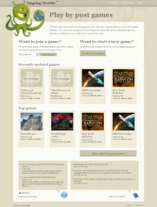
I’ve been rejigging the homepage!
 I’ve been rejigging the Ongoing Worlds website to:
- Help make it clearer what the site is about
- Help people find a game easier
- More easily show the features of the site
Things changed on the homepage
You might have seen the mockup I created and added to Facebook last month showing these changes. I wanted to get approval from users before implementing them.
- The freetype search has been removed, looking in the website analytics showed that this wasn’t used very much, so I’ve removed it for now. One possible reason it wasn’t used is that new users might not know what to search for, so would rather pick from a list, and members might navigate to their game from their ‘My Profile’ page, which lists all the games they’re a member of.
The search will probably return at some point as I believe it’s common practise to include a search in the top right of your website, and removing this might frustrate some people. But for now I wanted to remove it to make the other options clearer. - The ‘Want to join a game?’ option is now at the top, this is a dropdown box of game categories. If users are thinking about joining a game or want to see games on the site, they can see all games of a category by selecting them here. Read more…
New Design
I’ve been working this weekend on a design for the OngoingWorlds website. I’m not a designer so this process was very difficult for me. I knew quite specifically what I wanted from the design, but implementing it in graphical form is difficult! I wanted a design which is:
- Simple
- Easy Navigation
- Reasonably Neutral (to suit members of all different tastes)
- Fun, but not childish
I had a look around at some cool sites for inspiration, and found it at http://cssremix.com/ which lists some really nice sites that have a really clear simple style. I found that I liked the textured grainy background which was on a few sites, and the beige neutral colours were perfect for what I wanted. I took a lot of influence from one site in particular, and tried to copy from it without totally ripping it off!


